Creating a Dashboard
NOTE This task requires assistance from your eComm Specialist.
Dashboards are an amazing Salesforce tool to present real-time data in an easily digestible format perfect for sharing a summary of your success with other team members or campus leadership.
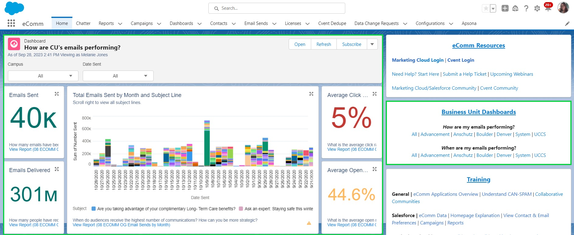
eComm's Salesforce Homepage, with a Dashboard in the main view. On the right, you'll also notice two sets of Dashboards available to help address how and when emails are performing. These Dashboards have a variety of filters available so users can see data relevant to them. Need a new filter or an update to an existing one? Submit a help ticket and it will get addressed soon.
While the existing Dashboards address most needs, eComm Specialists have access to create Dashboards. If you are a user seeking an additional Dashboard, reach out to your eComm specialist to see if they can support it or know of an existing Dashboard to address your needs.
eComm Specialists | Get Started Creating New Dashboards
- Complete TrailHead Training
- Outline Your Vision
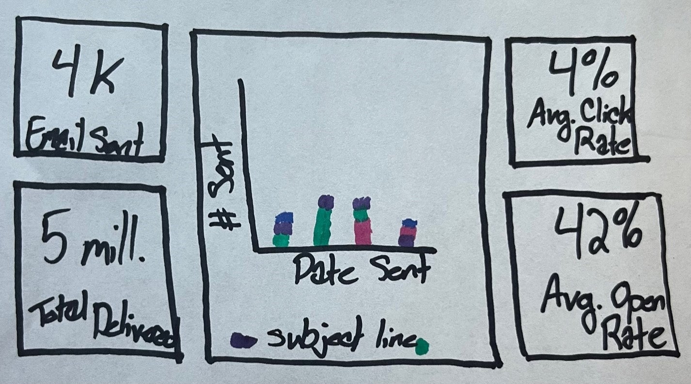
- Based on what you learned about Dashboards, draw your intended Salesforce Dashboard. Create an outline for each component and within each draw what will be displayed (number, pie chart, bar graph, etc.) and the name of the fields that are driving the data points. For example, you'll see an example below that started the Dashboards available on the homepage. There are 5 components with the one in the middle being a bar graph with 'Number of Emails' on one axis and 'Date Sent' on the other. Doing this exercise is critical to creating your first Salesforce Dashboard. Without a vision, the limitless options available to customize a single component, let alone an entire Dashboard can become overwhelming.