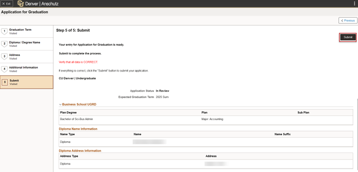
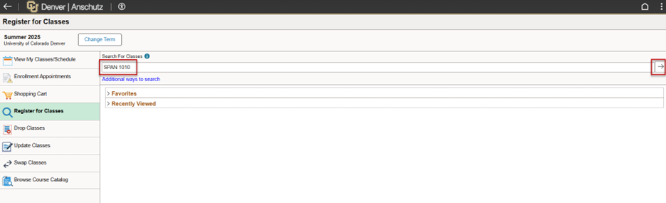
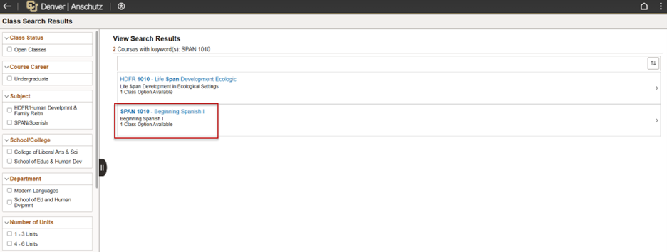
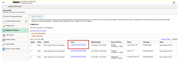
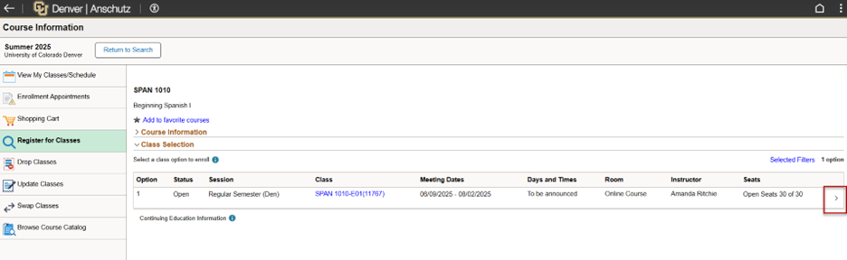
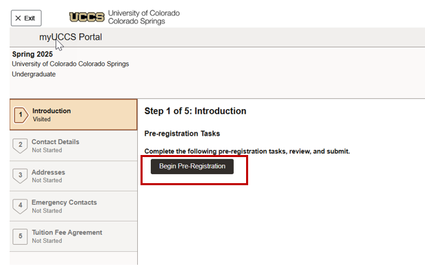
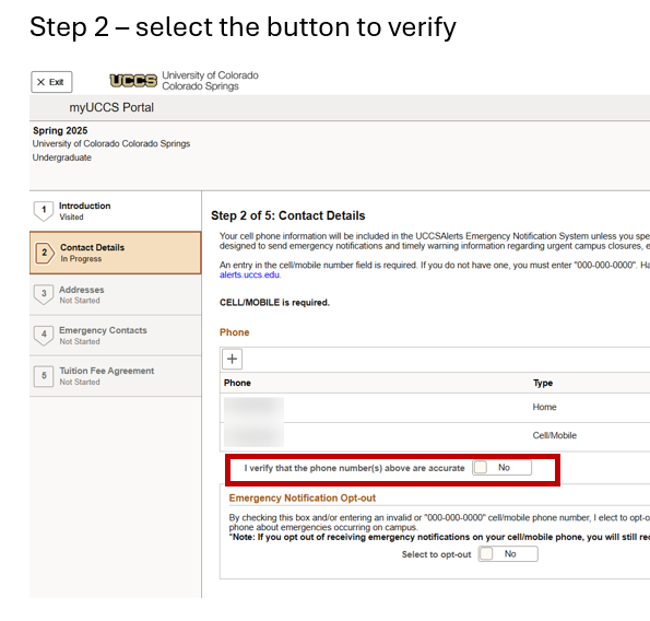
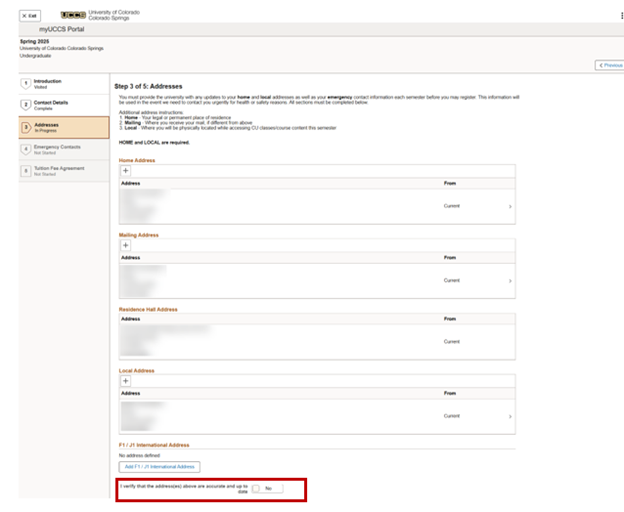
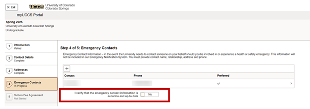
In fall 2025, the Campus Solutions Student Self-Service upgrade will enable CU students to move from the Student Center in their portal to browser pages on desktops, smartphones and tablets.

In addition to the minor changes to the Student Center used by CU Denver and UCCS students, new navigation menus and other changes will improve all CU student self-service pages from Financial Aid, Student Records, Registration, the Bursar's Office and the Law Bidding page for University of Colorado Law School students.

Why is the Student Self-Service navigation changing?

Functionality hasn’t really changed, but the look and feel are very different.

In the old version, clicking a Student Center icon opened a new frame within the student portal. Navigating within frames can be clunky and frustrating. Oracle, our Campus Solutions vendor, no longer supports navigating within frames and instead offers fluid navigation.

The new design also meets accessibility requirements, allowing CU to no longer need a third-party product for this purpose. The upgrade also allows CU to readily adopt any new functionality Oracle delivers, as new features will only be offered for fluid pages.

Now, when a student clicks any Student Center icon, a new page opens in their browser instead of within a frame in the Student Center.

While the improved navigation may be intuitive for most students, University Information Services provides the following visual guides to identify changes and new workflows.

Click a topic to explore specific changes.

Student Center in the Student Portal (UCCS and CU Denver)

CU Boulder students will not see changes within their Buff Portal, while CU Denver and UCCS students will find minor changes to the Student Center when they enter their student portal:

Student Center new

The old and new Student Centers seen side-by-side highlights the changes.

Student Center Old and New vesions

Most icon options remain the same: Academics, Admissions, Class Search, Student Account, Financial Aid, Register for Classes and Profile.

Task—Holds and Tasks—To Do’s are now combined as one: Tasks (Holds & To-Do Items). Like the previous version, a notification alert appears as a number in a circle when you have an active To-Do item or a hold.

The Advisor option is now found under Academics in the left navigation menu.

Example of the Academic page with Advisor in the menu

Mobile version

The new navigation works on mobile devices, with slight differences. After clicking any icon on the Student Center, a new browser page will open to that area’s menu. Here’s an example from Financial Aid on a mobile device:

Self Service pages on a mobile device

NOTE: Menu options may vary depending on your campus.

After you click and go to a specific page, use the back arrow to return to the Menu.

Use the back arrow to return to the main menu on a mobile device

Academics

After a student clicks the Academics icon, an Academic Progress page will open in a new browser tab with a left-side menu that allows students to more easily navigate to different pages.

Example Academics page

Admissions

After a student clicks the Admissions icon, an Admissions page will open in a new browser tab with a left-side menu that allows students to more easily navigate to different pages.

There are no other significant changes under Admissions.

Class Search

Students can search for classes using the filters on the left side menu.

Class Search screenshot

Student Account

Besides the page opening in a new tab with the left-side navigation, little has changed under Student Account. The new menu has the same options as the old version that popped up within a frame in the Student Center.

OLD example of the Student Account menu

Clicking View Bills and Payment Options takes the student to Nelnet, CU’s electronic payment service provider, just as it did in the old version.

View Bills page in the new version

Under Direct Deposit Student Refunds, the same information is shared with an option at the bottom to enter your direct deposit account number, confirm and submit it. The only difference is the top graphic has been removed, simplifying the page.

The old Direct Deposit page

The new direct deposit page

Financial Aid

In the previous version, when a student clicked the Financial Aid icon, a new frame would pop up the student portal displaying a Campus Solutions page with a financial aid menu. 

Old version of the Student self service financial aid page

NOTE: Some options, Summer Applications and Professional Judgement Estimator, are unique to specific campuses. Your menu options may vary depending on your campus.

After selecting one of the six menu items, students would select the aid year they wanted to view.

Choosing the aid year OLD version

In the updated version, after a student clicks the Financial Aid icon in the Student Center, a new browser tab opens, asking the student to select the aid year first. 

Aid Year page in the new version

After selecting the aid year, navigation options appear on the new left-side menu of the default landing page for your Financial Aid Award Summary.

New FA award summary

In the old version, students would scroll to the bottom of the page to find the Accept/Decline Awards and Financial Aid Summary buttons.

An example of the old accept or decline buttons

Those two options are available now as items on the left-side menu.

Accept or Decline New Menu

The workflow to accept or decline an award is the same with a slightly different layout. After a student selects Accept or Decline from a drop-down menu, they will select Submit. They also have the option to check Reduce.

Accept Decline or Reduct Award screen

Register for Classes

TBD

Profile

Similar to other areas, clicking the Profile icon opens a new browser page with a left-side navigation menu.

New Profile page

Navigating and making changes are intuitive. For example, to add a new address, a student would click Addresses, then the Add Address button. A form will pop-up for the student to enter new information and click Save.

Add Address screen

Law Bidding