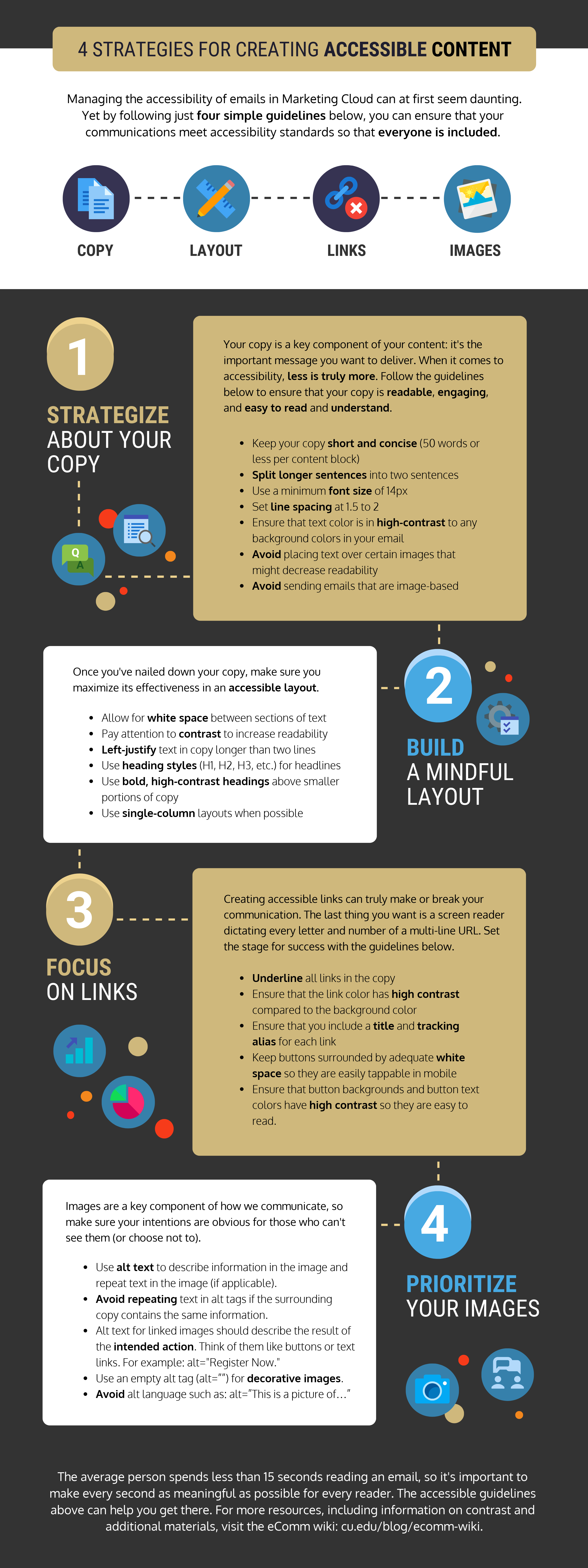
4 Strategies for Creating Accessible Content [1]
Managing the accessibility of emails in Marketing Cloud can at first seem daunting. Yet by following just four simple guidelines below, you can ensure that your communications meet accessibility standards so that everyone is included.

Strategize About Your Copy
- Keep your copy short and concise (50 words or less per content block)
- Split longer sentences into two sentences
- Use a minimum font size of 14px and avoid thin font weights.
- Set line spacing at 1.5 to 2
- Use italics or bold for emphasis sparingly.
- Ensure that text color is in high-contrast to any background colors in your email. Are My Colors Accessible [3] is a useful website that will tell you if the colors you're using pass WACG 2.0 recommended color contrast guidelines.
- Avoid placing text over certain images that might decrease readability
- Avoid sending emails that are image-based.
- Avoid using colors and underlines for emphasis for non-linked text.
Build a Mindful Layout
- Allow for white space between sections of text
- Pay attention to contrast to increase readability
- Left-justify text in copy longer than two lines
- Use heading styles (H1, H2, H3, etc.) for headlines
- Use bold, high-contrast headings above smaller portions of copy
- Use single-column layouts when possible
Focus on Links
- Underline all links in the copy
- Ensure that the link color has high contrast compared to the background color
- Avoid using link text such as: read more, click here, learn more. Be descriptive and concise in the linked text, allowing readers to know what they will find by clicking on the link.
- Bad Practice: There are many strategies for creating accessible content. Learn more here [4].
- Good Practice: Learn 4 Strategies for Creating Accessible Content [4].
- Ensure that you include a title and tracking alias for each link
- Avoid displaying the actual URL as a link. A screen reader will read every single character in the URL. The exception to this rule is linking email addresses. It's correct to type out the email address and then link the email address.
- Don't link to an email address in other text. An email address should always be typed out fully and linked, even in a signature line.
- Bad Practice: Questions? Email us [4].
- Good Practice: Questions? Email us at email@address.com [4].
- Keep buttons surrounded by adequate white space so they are easily tappable in mobile
- Ensure that button backgrounds and button text colors have high contrast so they are easy to read. For example, don't use white font on a gold background or gold font on a white background.
Prioritize Your Images
- Use alt text to describe information in the image and repeat text in the image (if applicable).
- Avoid repeating text in alt tags if the surrounding copy contains the same information.
- Alt text for linked images should describe the result of the intended action. Think of them like buttons or text links. For example: alt="Register Now."
- Use an empty alt tag (alt=””) for decorative images.
- Avoid alt language such as: alt=”This is a picture of…”
- Use graphics and images to support email content, not replace it.
- W3C has a helpful decision tree resource [5] for determining if an image needs alt text.
The average person spends less than 15 seconds reading an email, so it's important to make every second as meaningful as possible for every reader. The accessible guidelines above can help you get there. For more resources, including information on contrast and additional materials, visit the eComm wiki [6].
